MY ROLE
All creative was made by me other than the photography which was sourced from free to use vintage stock photo websites.
CLIENTS ASK
To create a new brand system that fit their vision for creating a new and engaging experience for their customers that would go beyond just sitting down and having a beer, all while setting them visually apart from the 60+ other breweries in the area.
DETIALS
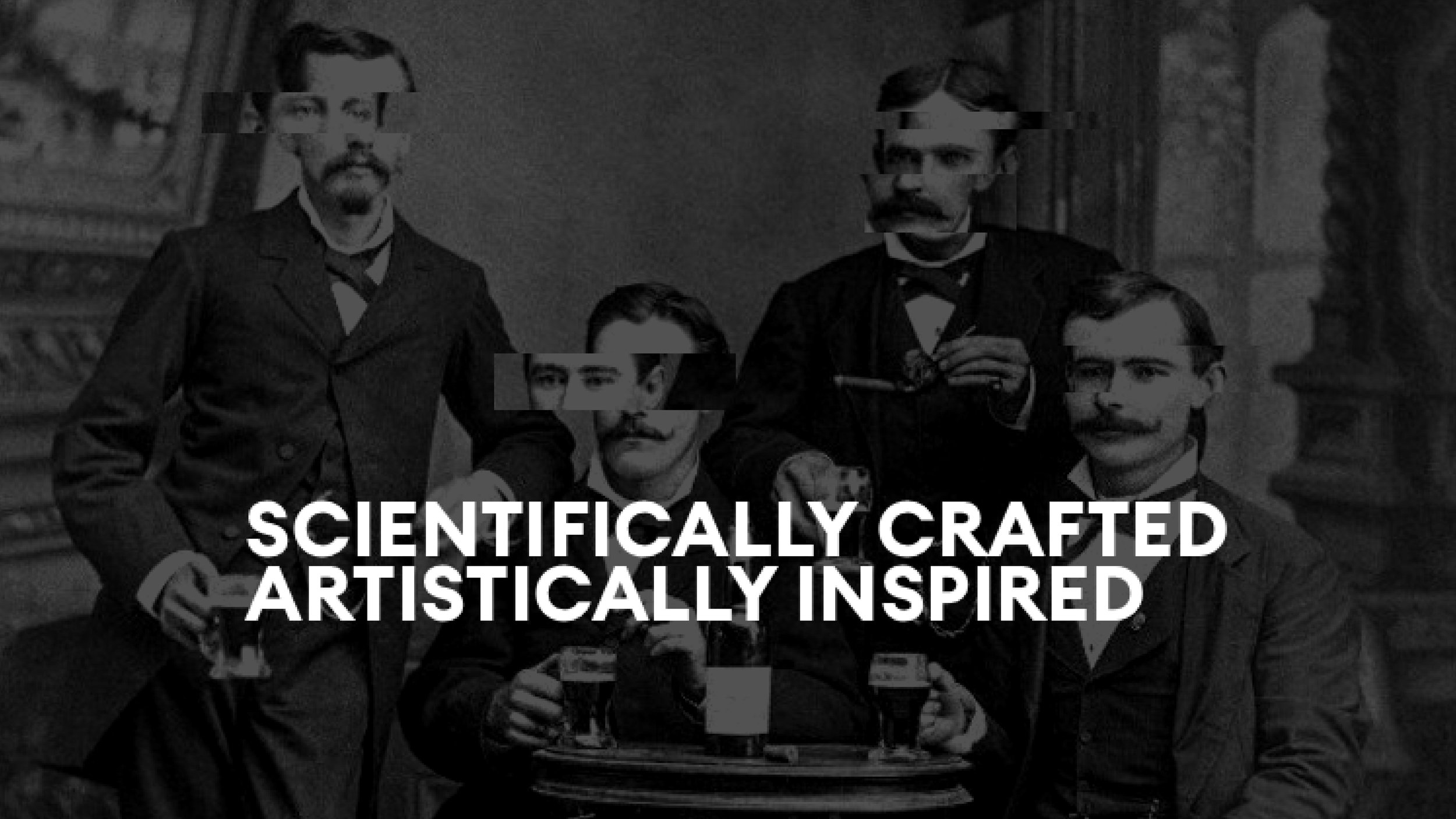
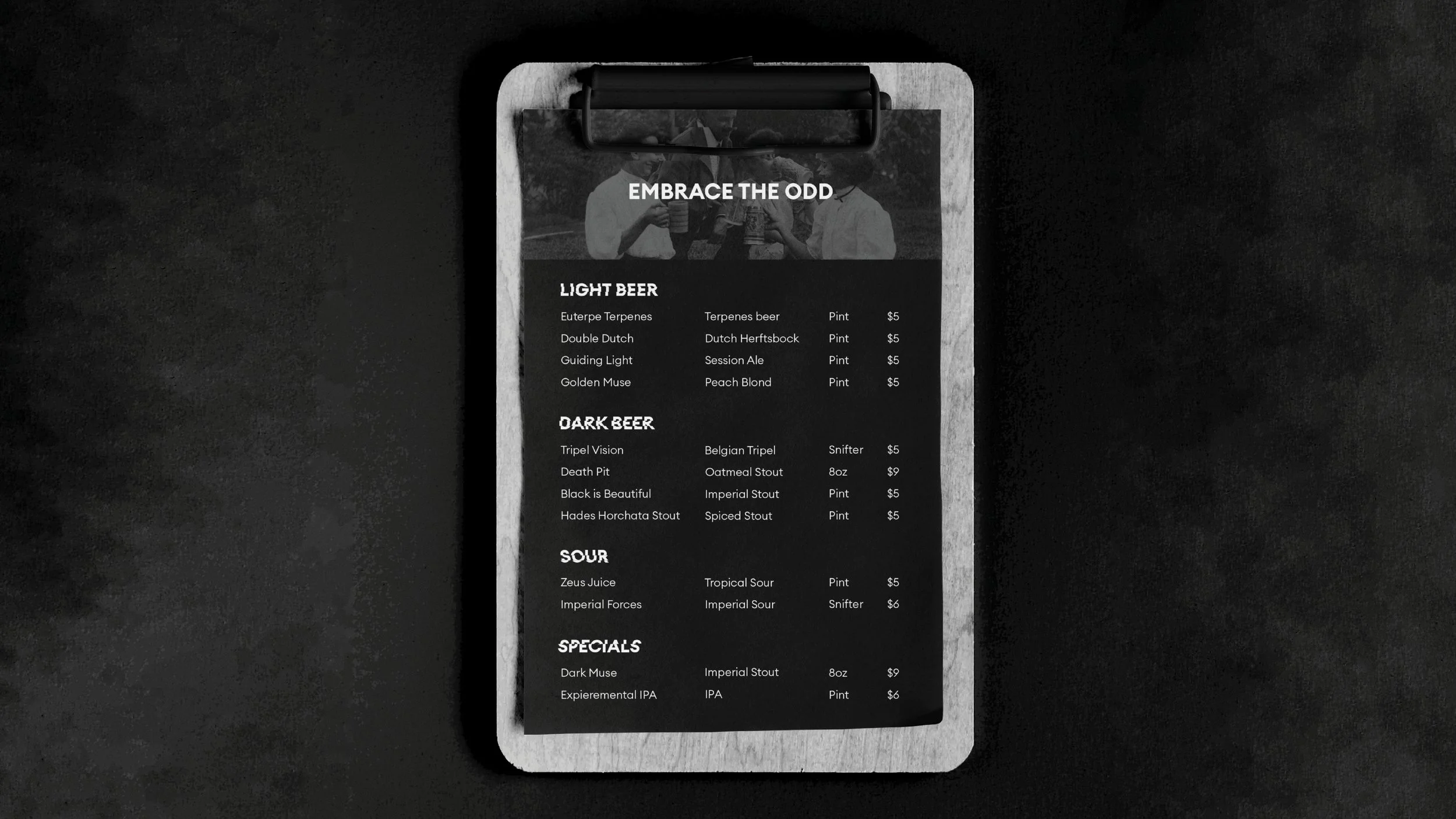
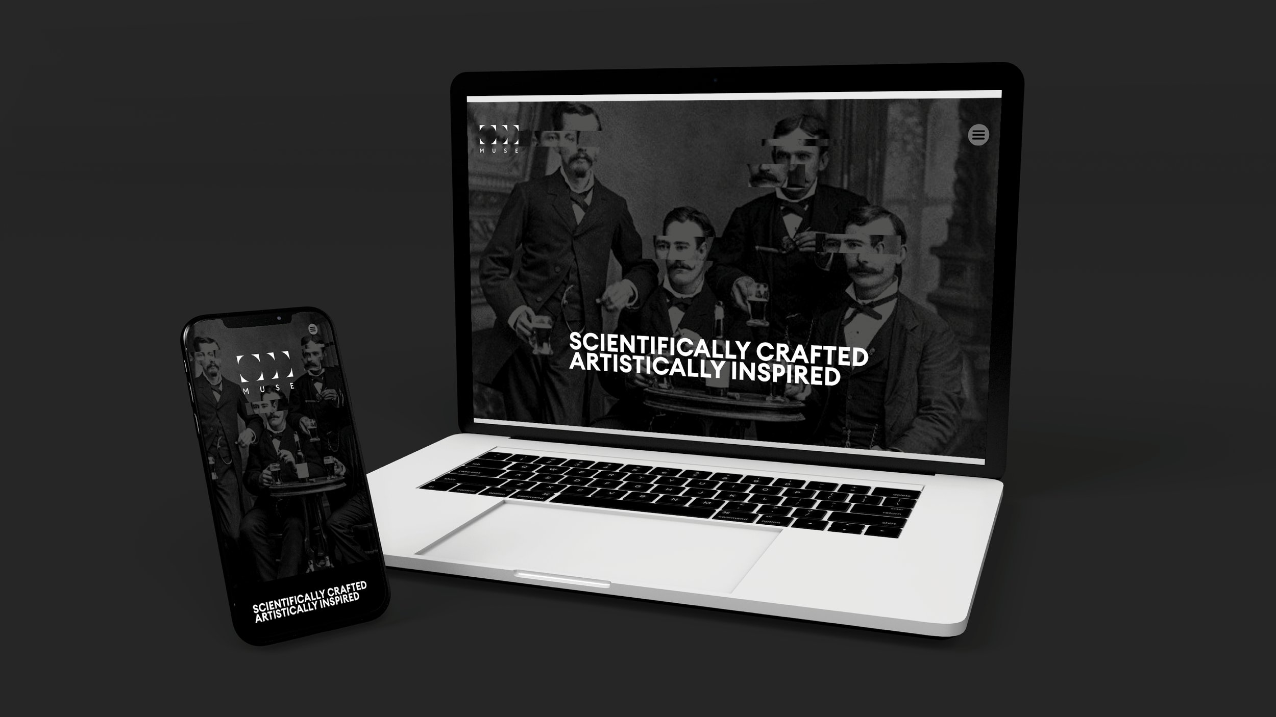
Odd Muse Brewing, located in North Dallas, is a distinctive brand dedicated to creating memorable experiences for its guests beyond just the brews. With a mission centered on crafting unique drinks grounded in brewing science, we developed the taglines "Embrace the Odd" and "Scientifically Crafted, Artistically Inspired."
Guided by these taglines, we experimented with visuals that balanced creativity with scientific rigor. Drawing inspiration from the brewery's esoteric ambiance, we crafted a brand narrative reminiscent of secret societies. This approach aimed to provide patrons with a sense of exclusivity, making them feel like they were part of something special upon entering the bar.
To further enhance the engagement at the brewery, we designed a theme inspired by covert political clubs, integrating hidden messages throughout the design. This not only elevated the visual appeal of the packaging but also offered an interactive and engaging activity for the guests.
ODD MUSE
PROJECT TYPE:
Freelance
YEAR:
2021
ABOVE
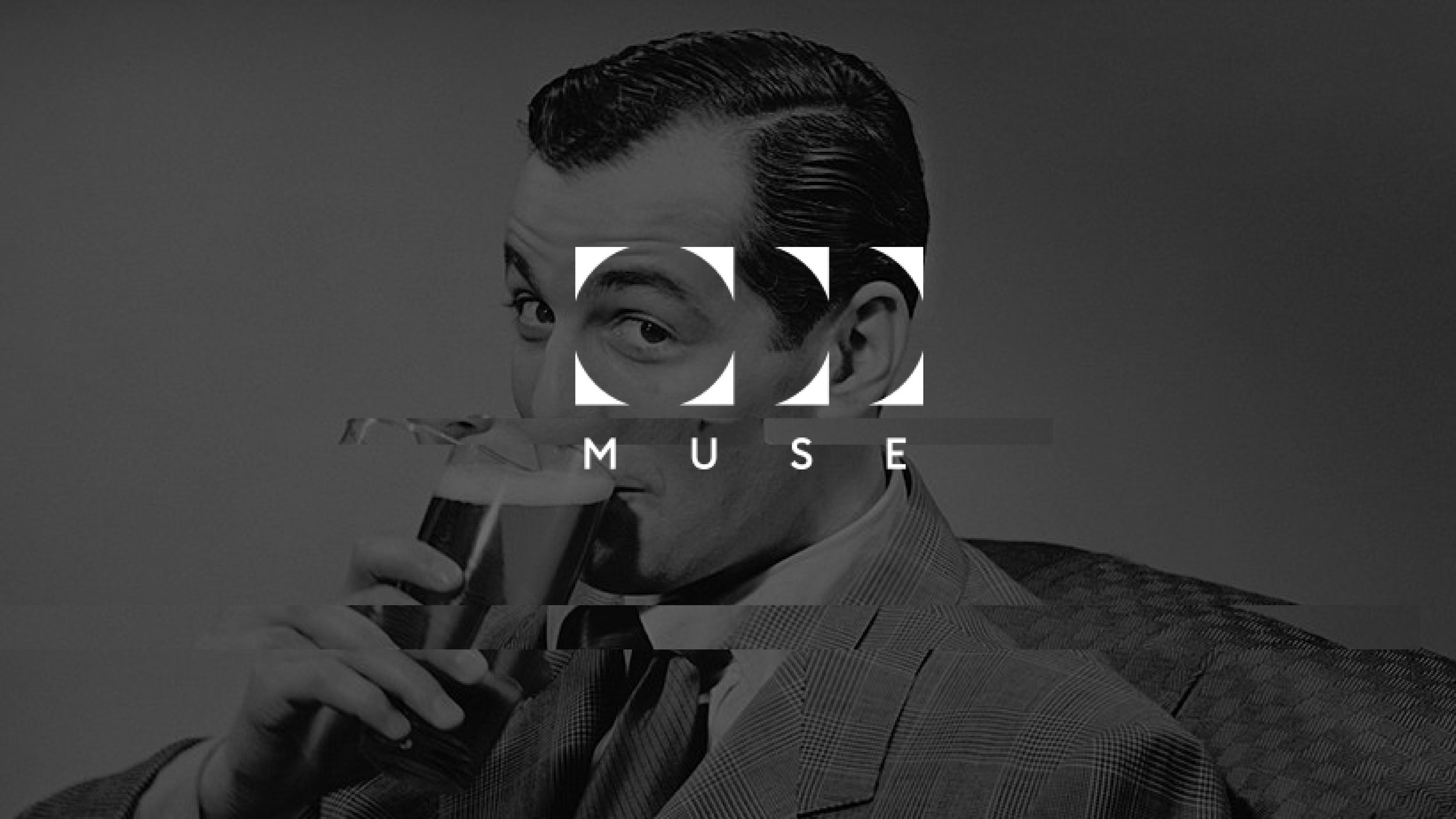
I designed the logo with the counters removed to speak to the mysterious and secret society feeling of the brand. Removing the counters and allowing the viewer to read between the lines to discover the logo gives a sense of discovery, a feeling which is found throughout the campaign. The photograph was sourced from public domain vintage photography.
BELOW
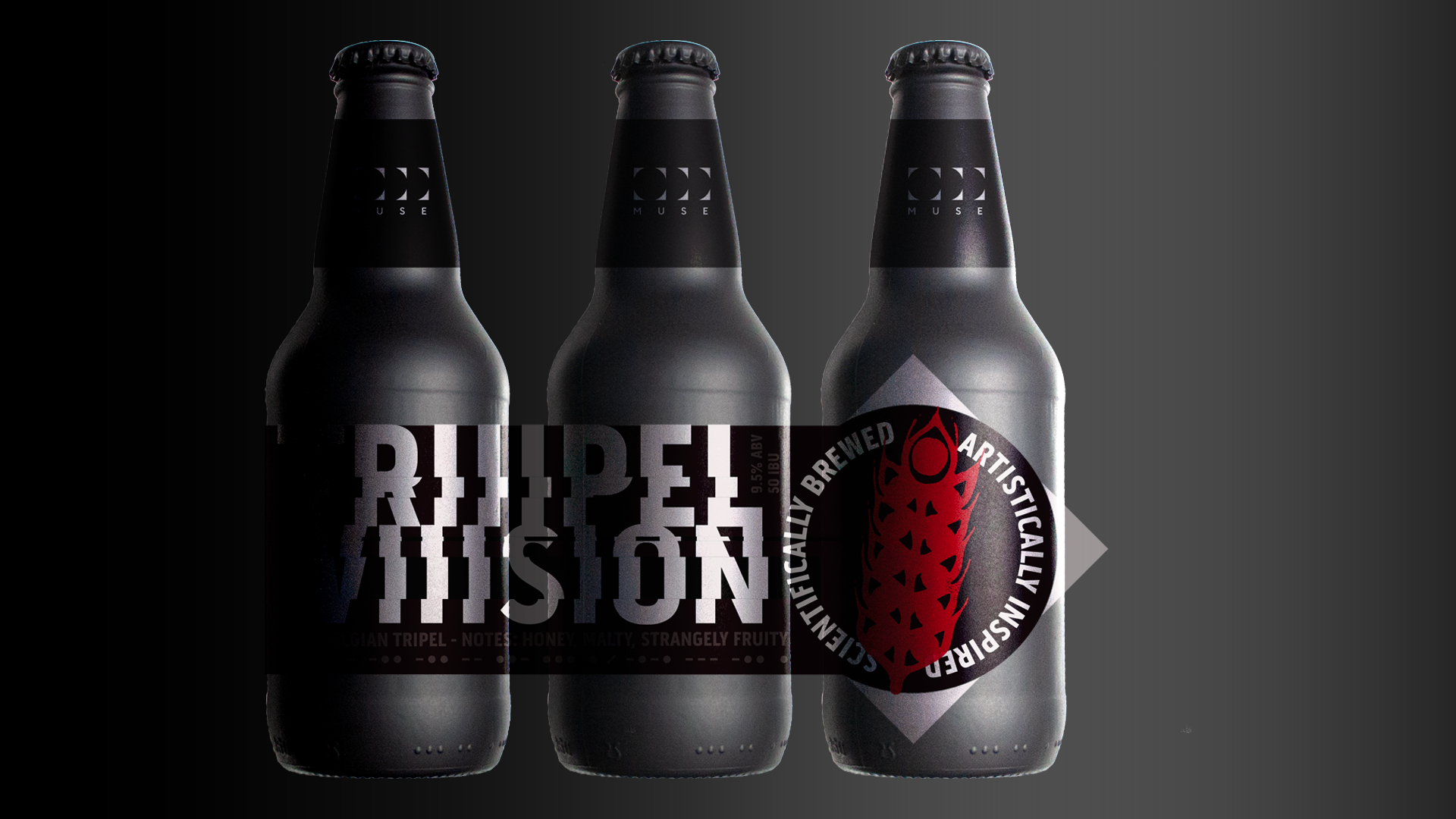
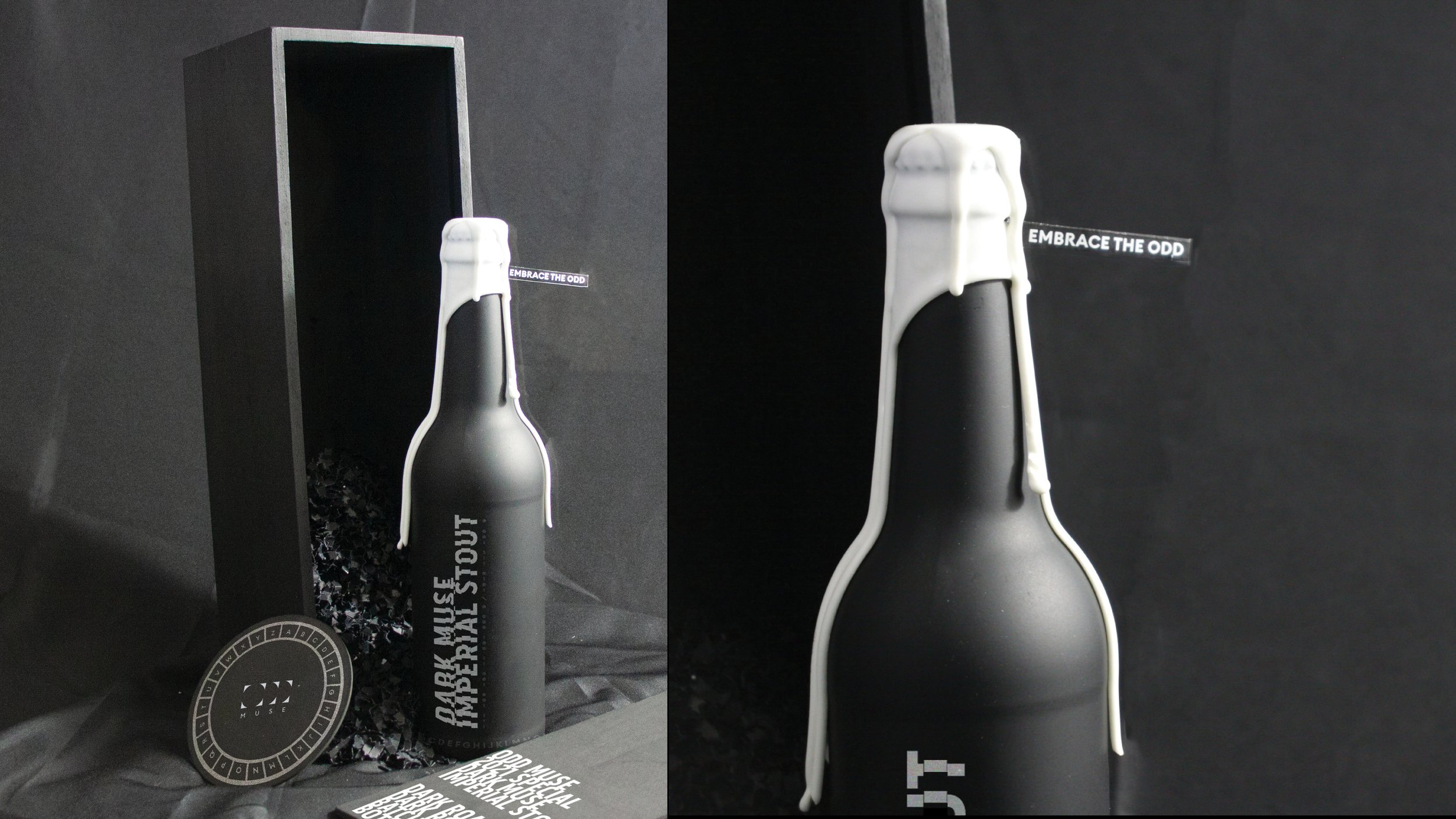
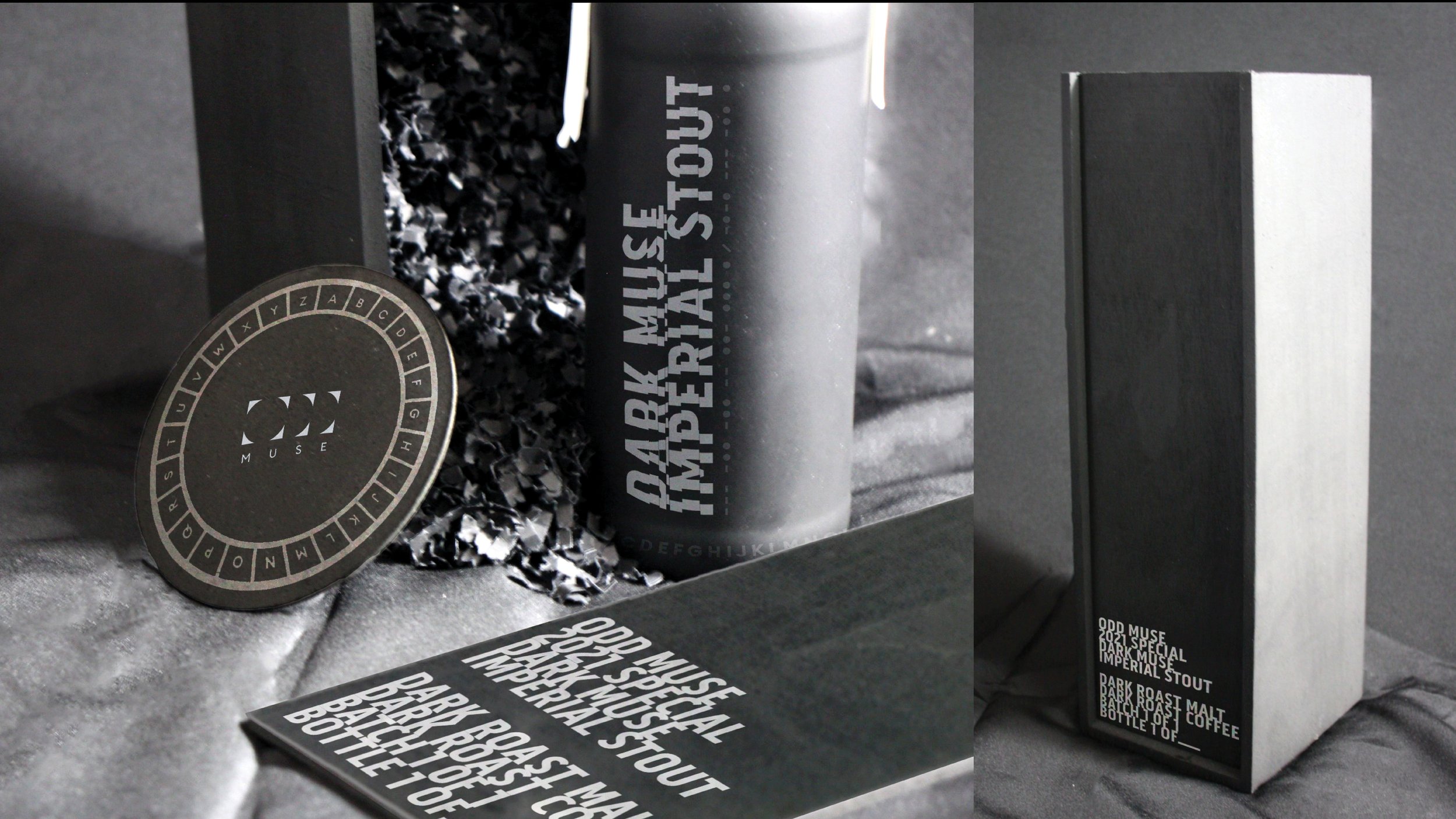
All of the brand's packaging includes hidden messages as design elements and adds a level of engagement with the product beyond beer drinking. I also got to aid in renaming the beers, many of which cleverly utilize the brew style in the name. The example below is a Belgian Tripel, which we named Triiipel Vision. The tasting notes speak to the brand voice using copy such as "Notes of honey and strangely fruity." We chose to include an accent color on all of the bottle's illustrations to make it easier for consumers to differentiate between products. I created, designed, shot, and edited all packaging mockups.
ABOVE
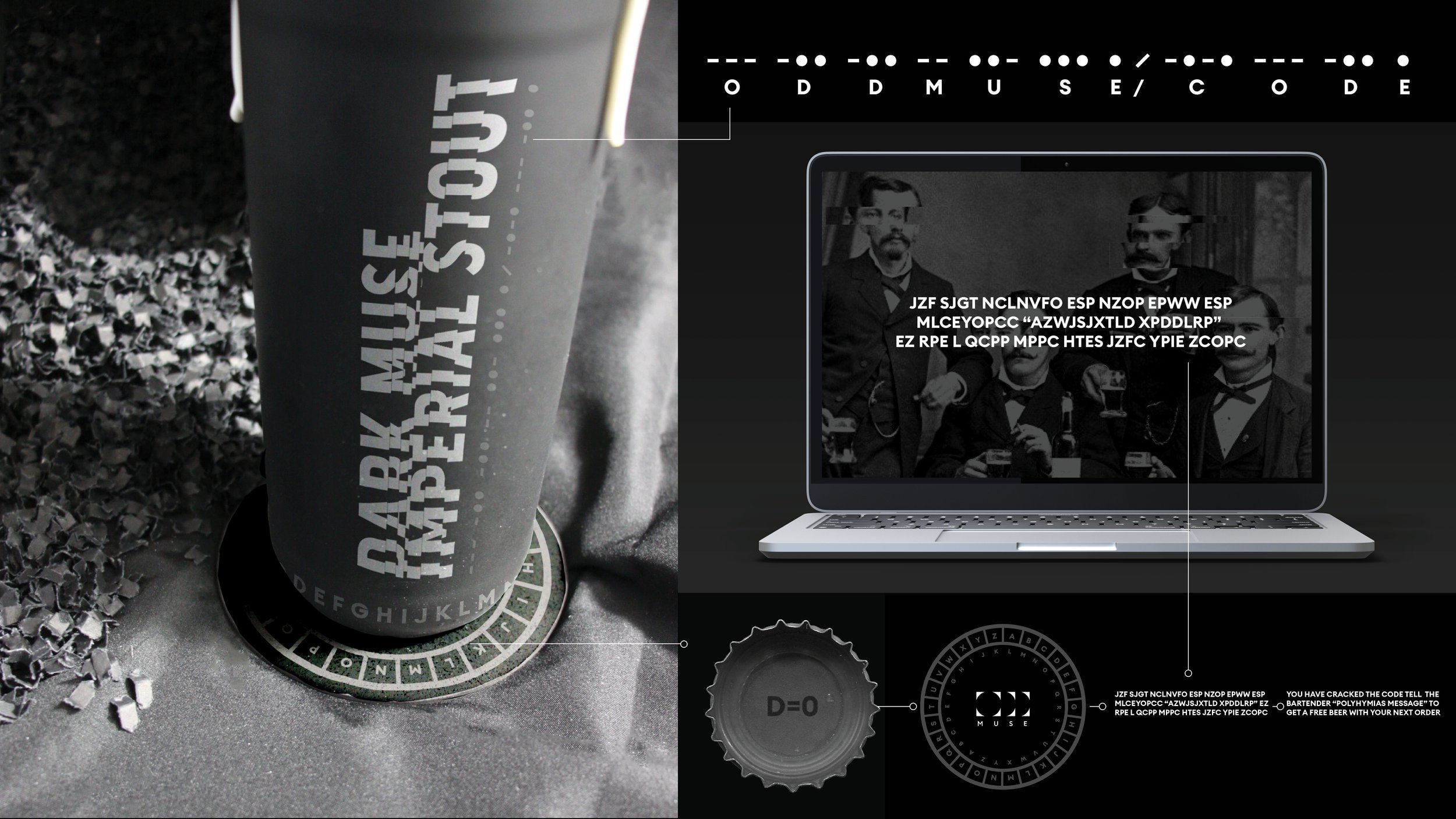
The small batch releases include an extra level of engagement through more complex puzzles and codes for consumers to decipher. We envisioned craft beer enthusiasts splitting a bottle of a truly unique beer with friends while sitting in a dimly lit room, attempting to solve the mystery of the bottle. Inspired by alternate reality games (ARGs), I built a 4 part puzzle that involves deciphering the Morse code design element on the bottle, which takes you to a link on the Odd Muse website. Next, consumers would have to crack the substitution alphabet-coded message on the website utilizing the cipher on the inside of the bottle cap by aligning the lettering on the bottom of the bottle to the correct space on the coaster. Cracking the code will reward you with a free beer on your next visit.
BELOW
The image below was sourced from a public-domain vintage photography website. I distort the faces as a simple visual element to tie the imagery and text together. The photography was chosen to promote being part of something special and secretive. I wrote the copy "Scientifically crafted, artistically inspired" to summarize the core mission of the head brewers at Odd Muse. "Embrace the Odd" was also written by me to be the company's core tagline that encompasses the entire vibe of the brand.
