LOGOS
This collection showcases logos made over the last five years, starting in 2018. My logo process is founded on research gathered from interviewing clients about their industry and gathering insight through a deep dive into the field in which the client operates. The next step is to begin sketching, which involves lots and lots of rough pencils. I average about 40 quick logo ideating, but I may do up to 200. Rough pencils are then culled down into a handful of tight pencil sketches, which are then traced in Illustrator or created directly on the computer, depending on the style of the logo. Next, I narrowed it down to the best handful of logos before sending them to the client. From there, we narrowed it down further, revising, rinsing, and repeating it until we had the final product. Below are 17 of the 80+ logos I have designed since 2015.
CLIENT
DESCRIPTION
The Bore and Barrel
Bore & Barrel is a gunsmith, men’s apparel and accessory shop, and vintage arms museum. The client was looking for a logo that would fit seamlessly into their vintage American interior design theme, which encompassed the store. I designed the logo in warn flag colors and based the shape on the front view of a gun barrel.


CLIENT
DESCRIPTION
North Texas Makers
North Texas Makers is an arts organization that a fellow artist and I co-founded. The original logo was similar in style but said DMF for the Denton Makers Festival. I art directed the original mark, then created the new logo when I proposed changing the company's name to pull creatives and consumers from outside the Denton Area. I chose to focus on a vibrant color pallet to showcase the brand's creativity, which we could then limit to one to two colors when branding specific events with limited pallets or collaborating with other venues.

CLIENT
Dragon Scale Leatherwork
Dragon Scale is a handmade leather goods company specializing in Renaissance-inspired artisan crafts. The client wanted a logo that would transfer well to a brand to mark their leather projects.
DESCRIPTION


CLIENT
Southpaw Movement
Southpaw Movement is a yoga and pilates company based in Dallas, Texas. The owner worked with athletes recovering from injuries and yoga girls. I designed this logo to be approachable for both markets.
You can see Will Patterson critique an older iteration of the logo here.
DESCRIPTION


Lorenth
CLIENT
DESCRIPTION
This mark is a concept for Lorenth, a crypto-based game startup. Per the clients request, the logo references Hitch Hikers Guide to the Galaxy with the number “42” hidden in the form of the L.

Ion National Bank
CLIENT
DESCRIPTION
This was a logo concept for Ion National Bank. The clients ask was to be modernized and appeal to a younger market. I designed the logo to reference ions moving around the nucleus of an atom and to indicate upward movement.

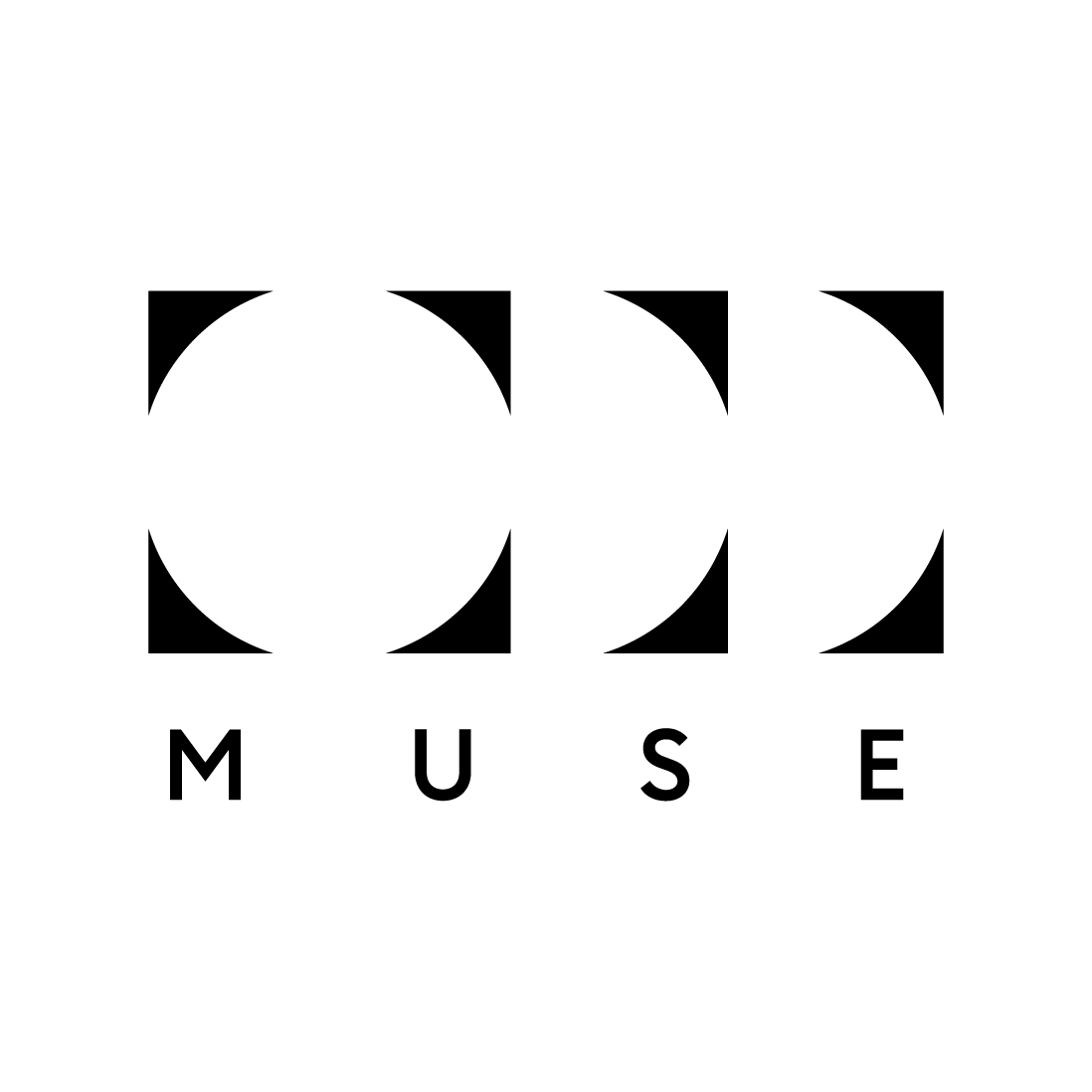
CLIENT
Odd Muse is a small-batch craft brewery in Dallas, Texas, specializing in artfully crafted and scientifically brewed beers. I designed the logo to fit the theme of discovery I created to engage customers visiting the establishment.
Odd Muse
DESCRIPTION

CLIENT
Cyntroid Cyber Security

Cyntroid is a Cyber Security and Marketing Startup located in Dallas, Texas. A Centroid is the intersection of points on a triangle. I based the logo on that concept to achieve a feeling of interconnectedness. Additionally, I angled the triangle up to imply upward mobility and forward-thinking. The colors were chosen to feel modern but not fall into the standard tech industry color scheme.
DESCRIPTION

CLIENT
Seagull & Swan
DESCRIPTION
This is an ongoing project. Check back soon for more information.

CLIENT
DESCRIPTION
The Tomato Pizza
The Tomato Pizza was founded in 1984 and quickly became a staple in Denton, Texas, until it tragically burned down in 2007. In 2024, the original owners son took up the torch and began reopening the iconic Chicago style pizza joint. The new owner tasked me with creating something reminiscent of the old logo, while also being more appropriate for the counter culture vibe unique to Denton, Tx. This logo was roughly drawn out by an artist and I took the idea and ran with something a little more appropriate for a logo.

CLIENT
Falcon Events
This was the logo chosen to begin the rebranding process of Falcon Events. The company wanted an iconic mark that represented the speed and straighten of a falcon to showcase the brands confidence in their work and efficiency. I started with an image of a falcon mid attack and simplified the form into something that resembled both the bird and an F.
DESCRIPTION

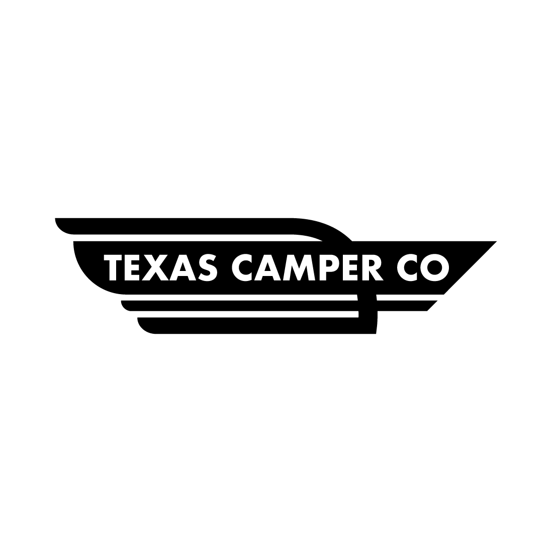
Texas Camper Co
CLIENT
DESCRIPTION
Texas Camper Co is owned by a husband and wife team that build custom campers for client. I referenced the general shape of their camper while drawing inspiration from vintage aluminum camper logos.

CLIENT
Deal Findrs
DESCRIPTION

Deal Findrs is a reality group that specializes in identifying investment properties for clients in the rental property space. I made a logo for the client that indicated financial growth, upward mobility, and the housing sector by integrating an arrow and graph lines to form the shape of a house.
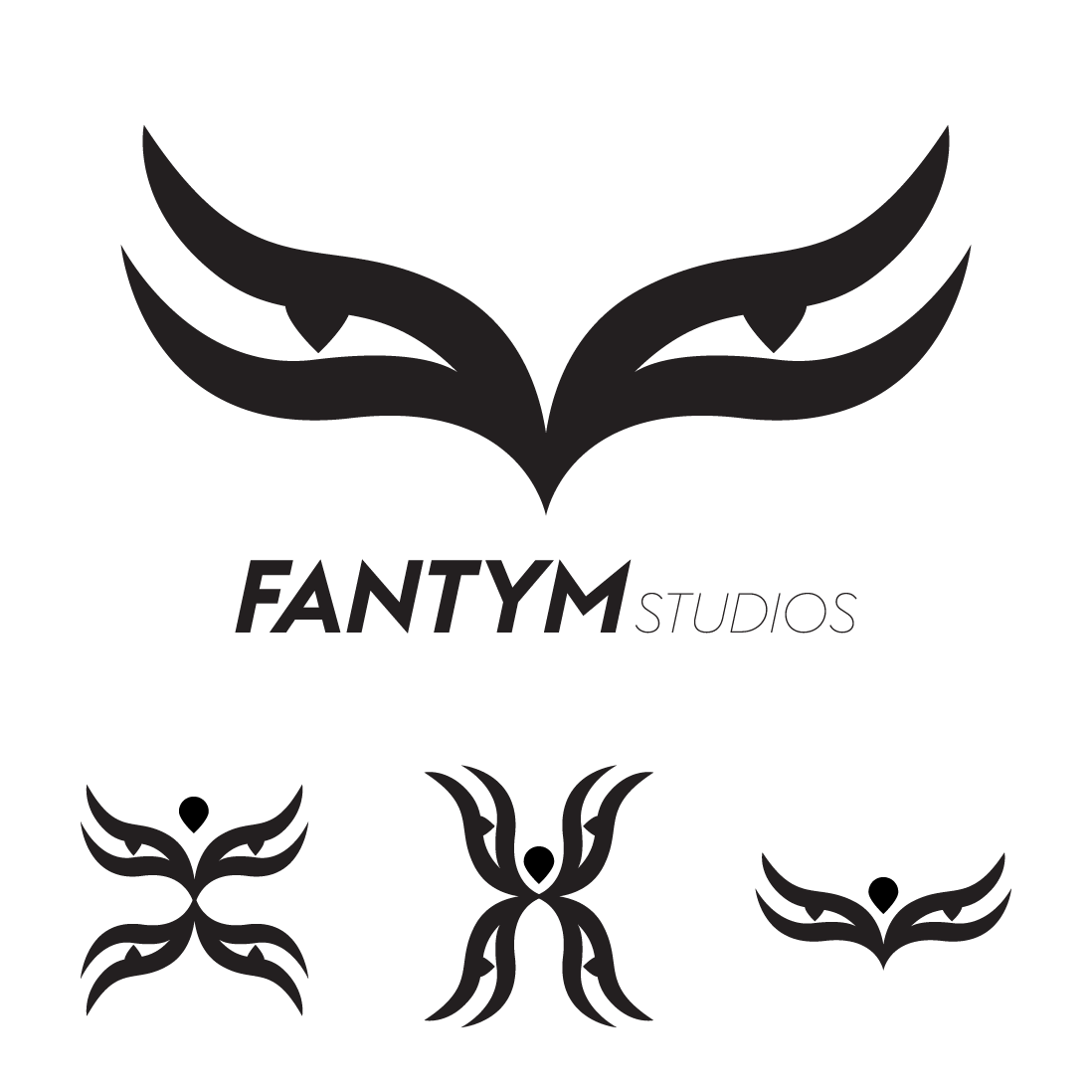
CLIENT
Fantym Studios
Fantym Studios is a creative collaborative group that experiments with new methods of visual storytelling. I built a small modular log system that the brand can use to distinguish between projects while feeling cohesive by utilizing the eye shape to creative various phantom marks.
DESCRIPTION
CLIENT
Outlands Event Production
DESCRIPTION
Outlands was an event production company that worked with large apartment complexes in Texas college towns. Their primary goal was to be the connection between young renters and apartments by hosting music festivals at the complexes. The cactus logo is meant to resemble someone dancing.