MY ROLE
All creative was made by me.
CLIENTS ASK
The owner of Southpaw Movement needed a visual identity system that allowed them to make yoga an approachable brand for both yoga girls and career athletes re-covering from injuries post physical therapy.
DETIALS
Southpaw Movement is a Texas-based company specializing in Yoga, Pilates, Barre, and general movement training. The owner provides tailored training for a diverse clientele but focuses on athletes seeking injury prevention and recovery. Given the brand’s broad audience, developing a personality that resonated with a wide range of individuals was essential.
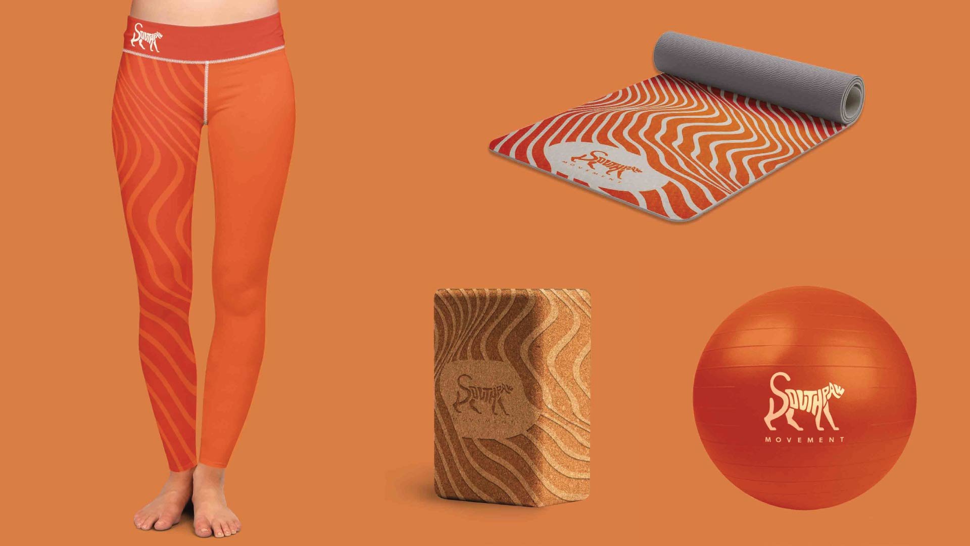
I selected an orange-based color scheme to distinguish the brand from the typical yoga aesthetic to achieve this. This choice set the Southpaw Movement apart and conveyed an approachable and dynamic personality, appealing particularly to career-oriented athletes. The colors were chosen to reflect energy, warmth, and accessibility.
Furthermore, the logo design incorporates bold and organic lines, symbolizing movement, strength, flexibility, and enjoyment. These elements collectively embody the essence of the Southpaw brand and effectively communicate its offerings to the target audience.
SOUTHPAW MOVEMENT
PROJECT TYPE:
Freelance
YEAR:
2020


ABOVE
I designed all the assets in this piece. Mockups were made with free resources. The Poster is a branded recreation of a medical diagram included in teaching materials that accompany the book “Anatomy Trains: Myofascial Meridians” by Tom Myers
